What Our Website Redesign Can Teach You About Your Own Brand
A behind-the-scenes look at how strategy, design, and user experience work together — from the team that usually writes the case studies about you.
We spend much of our time helping conservation leaders tell their stories. This time, we’re turning the lens on ourselves: we just applied our new Sustainable Economies brand to a full website redesign, and we want to share what we learned along the way.
Our goal isn’t to show off. It’s to give you a working example of how brand strategy translates into a real communications tool — the kind of tool your organization relies on every day to build trust, recruit partners, and move your mission forward.
Start With the “Big Idea”
Every strong brand starts with a single organizing idea. Ours is handcrafted precision — think a bespoke suit from Savile Row.
The precision comes from who we are: a research-driven firm that gathers the right data to make complex decisions easier for our clients. Exactitude and rigorous analysis are as essential to our work as precise measurement and cutting are to custom tailoring.
But precision alone isn’t the whole story. Like a master tailor, we’re also artists. What makes a bespoke suit exceptional isn’t just the technical execution; it’s the taste, judgment, and intuition behind fabric choices and fit. Our brand, research, and strategy work require that same blend of rigor and instinct, built over years of experience in the field.
The takeaway for your organization: before you touch colors or fonts, name the North Star idea that should govern every decision. If your team can’t agree on that idea, your design process will be full of disagreements as well.
Translate the Idea Into a Look and Feel
With “art and science” as our guiding tension, we grounded our visual identity in Swiss design principles — a grid-based approach known for clean typography, confident use of negative space, and an orderly, uncluttered feel.
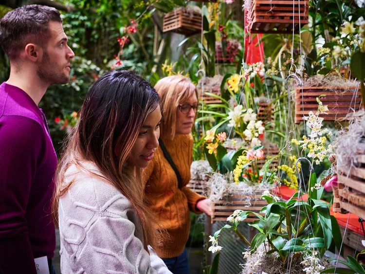
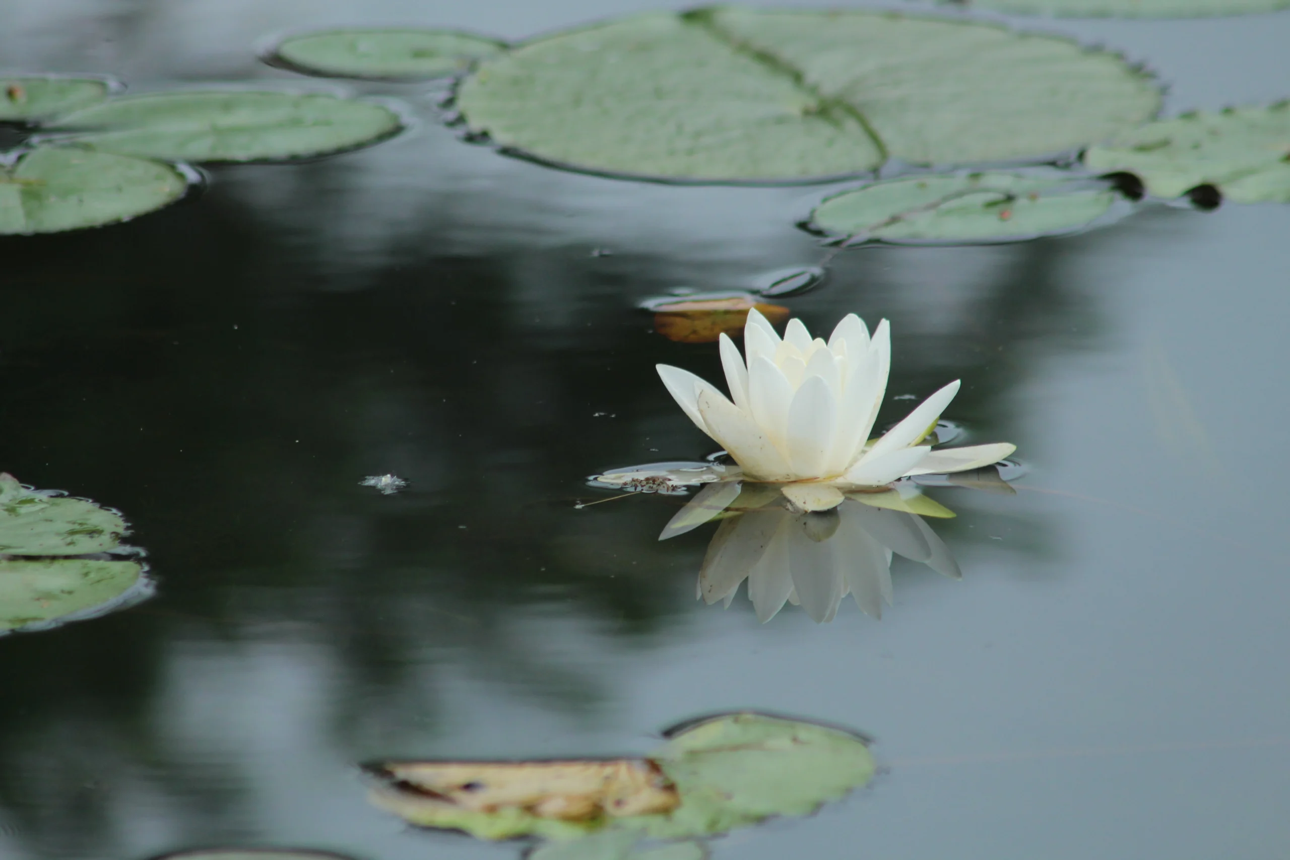
But conservation work isn’t just orderly — it’s also colorful, joyful, and occasionally whimsical, because it’s ultimately in service of nature and people. So our redesign balances Swiss structure with warmth: clean grids paired with vibrant photography and moments of playfulness.
The takeaway for your organization: your visual style should reflect the tension your organization actually holds — whether that’s science and storytelling, tradition and innovation, or urgency and hope. A brand that only expresses half of who you are will always feel incomplete.
Design for What Your Users Actually Need
Strategy and aesthetics only matter if they help people find what they came for. On our new homepage, we built direct gateways to the two things our audience wants most:
- Case studies from local and national conservation leaders — including how organizations built coalitions around riverfront redevelopment or evaluated dozens of programs at once
- Featured articles with original research, best practices, and field-tested insights from work with dozens of conservation organizations
Both link out to real strategic plans, impact studies, national research, and DIY audience-research tools — resources we hope you’ll actually use.
The takeaway for your organization: audit your own site against this question: can a funder, partner, or board member find proof of your impact in three clicks or fewer? If not, your web design may be working against you.
The Tools That Made It Possible
As Creative Director, four tools anchored my decisions in this redesign:
- Brand Strategy — our North Star, used to test every brand expression against a single standard
- Brand Style Guide — the colors, fonts, and visual rules applied consistently across every touchpoint
- Foundational Messaging — the articulation of who we are, what we believe, and the unique value we offer
- High-quality photography — a mix of professional and free stock images, chosen with care
If your organization is missing any one of these four, that’s the gap to close before your next website refresh or campaign.
Built With Great Partners
None of this happened alone. We’re grateful to have partnered with Brand Robear on visual identity and Pixel Power on web development — proof that even a “handcrafted” brand benefits from the right collaborators.
See It for Yourself
Our website is meant to be a resource for you: real research, real examples, and original insights from the field. Take a look, and let us know what you think — and what you’d want to see from a case study on your brand next.